Display methods for categorical response lists
Categorical responses are normally displayed one per line preceded by a check box (multiple choice) or radio button (single choice), but you can display them as a drop-down list or list box.
▪Drop-down lists allow respondents to choose one answer only and are therefore ideal for single choice lists. If a respondent selects a second answer, that selection replaces the previous selection.
▪List boxes allow any number of selections so are best for multiple choice lists. Respondents select answers using standard Windows selection methods.
Note Drop-down lists and list boxes do not support “other specify” responses (that is, a response with the other keyword) because they cannot display the additional input box for the other response. You can get around this problem by defining an ordinary Other response and then defining an additional “Please specify” question that is asked only of people choosing Other.
With single-choice lists you also have the option of displaying the responses as buttons. Respondents then click a button to choose a response and move to the next question. There is no need to click Next.
The response part of a question is known generically as the Control, so the way the response section or control is displayed is referred to as the Control Type. You define it using the control keyword in the metadata section or the question’s Control.Type property in the routing section.
In the metadata section
To display responses in a drop-down list or a list box, place the following after the question text:
style(control(type = "CType"))
where:
▪CType is either DropList or ListBox.
For example, if you type:
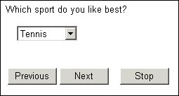
FavoriteSport1 "Which sport do you like best?"
style(control(type = "droplist")) categorical [1..1]
{Tennis, Football, Cricket, Basketball, Hockey};
the question will be displayed as:
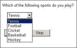
When the respondent clicks the arrow button at the side of the box, the full response list is displayed:
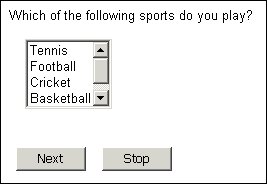
A similar question displayed as a list box — style(control(type = "listbox")) — is:
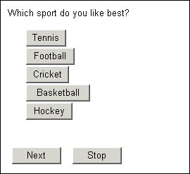
If you want buttons in a single-choice response list, type:
style(control(type = "button"))
after each response text that you want displayed in this way. For example:
FavoriteSport2 "Which sport do you like best?" categorical [1..1] { Tennis style(control(type = "button"))
Football style(control(type = "button"))
Cricket style(control(type = "button"))
Basketball style(control(type = "button"))
Hockey style(control(type = "button"))
};
This produces:
As the illustration shows, the interviewing program makes each button just as wide as is necessary to contain the response text. You can often improve the appearance of the page by making all buttons the same width. To do this, include the width keyword to specify the width for each button, and the interviewing program will display the response texts centrally on each button. For example:
style(control(type = "button"), width="20em")
In the Routing section
To specify a question’s control type in the routing section, type:
Qname.Style.Control.Type = ControlTypes.Type
where:
▪Qname is the question name.
▪Type is a keyword defining the control type, and is either ctDropList or ctListBox.
The previous examples could be specified in the routing section as:
FavoriteSport.Style.Control.Type = ControlTypes.ctDropList
Sports.Style.Control.Type = ControlTypes.ctListBox
For buttons, type:
Qname.Categories[{RespName}].Style.Control.Type =
ControlTypes.ctButton
where:
▪Qname is the question name.
▪RespName is the name of a response in the list. Use [..] to refer to all responses.
For example:
FavoriteSport2.Categories[..].Style.Control.Type =
ControlTypes.ctButton
For information about displaying images as buttons rather than using the response texts see
Images as buttons (clickable images).
Instructions and subheadings in drop-down lists
If a drop-down list contains nested responses (that is, responses at different levels) the interviewing program decides whether to treat the top-level responses as subheadings or as instructions.
If the list contains only one top-level text followed by one subgroup of responses, the top-level text is treated as an instruction text. It is displayed in the same typeface as the rest of the list; it appears as the default answer when the question is first displayed, and can be selected in the same way as any other response in the list. For example, if the question is defined as:
FavoriteSport3 "Which sport do you like best?"
style(control(type = "droplist")) categorical [1..1]
{
FS3Instruct "--Select--"
{
Tennis, Football, Cricket, Basketball, Hockey
}
};
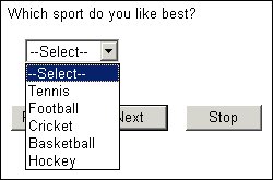
it is displayed with “−−Select−−” as the default answer, and respondents may select any response from the list (the routing section should reject “−−Select−−” if it is chosen).
Drop-down list with instruction text
If the list contains two or more top-level texts each followed by a subgroup of responses, the top-level texts are treated as subheadings. They are displayed in a different typeface to the rest of the list (the default is bold italic). Subheadings cannot be selected, so the first response in the first subgroup is presented as the default answer when the question is first displayed. For example, if the question is defined as:
FavoriteSport4 "Which sport do you like best?"
style(control(type = "droplist")) categorical [1..1]
{
Land
{
Tennis, Football, Cricket, Basketball, Hockey
},
Water
{
Swimming, Diving, Scuba, Sailing,
Waterski "Water ski-ing"
}
};
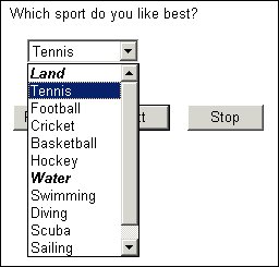
it is displayed with Tennis as the default answer. Land and Water appear in the list in bold italics but cannot be selected.
Drop-down list with subheadings
See also