Displaying response controls side by side with question text
In some types of surveys you might want an interview page that looks like a form, with abbreviated question texts followed on the same line by selection or input boxes. If you just write a template that has the Label and Controls elements on the same line separated by spaces, the interviewing program will allocate as much space as it needs to each question text and will then append the response list or input box to the end of the line. Nothing will line up and the page might be hard to use.
One solution is to use a table; an alternative is to use interview scripting alignment features (see
Alignment and positioning) and to set a maximum width for the question texts in the script so that long texts are forced to wrap across lines.
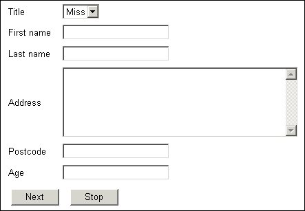
Here is a form created using the following tags in the body of the template:
<table>
<tr>
<td><mrData Index="1" QuestionElement="Label"/></td>
<td><mrData Index="1" QuestionElement="Controls"/></td>
</tr>
Repeat definition for indexes 2 to 5
<tr>
<td><mrData Index="6" QuestionElement="Label"/></td>
<td><mrData Index="6" QuestionElement="Controls"/></td>
</tr>
</table>
Question texts and response boxes side by side
▪The page displays six questions and the template defines positions for each question individually. This ensures that the question texts line up with their respective response controls. If you use a single
<mrData> tag for all questions and do not specify any alignment parameters in the script (see
Alignment and positioning), you might find that the question texts and response boxes do not line up because the boxes take up more vertical space than the texts. For further information about templates for displaying more than one question on a page see
More than one question on a page.

