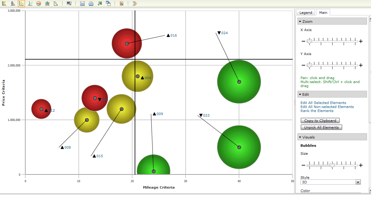

Node | Option |
|---|---|
Criteria | You can configure the following settings: ▪ X Axis: Select the criteria or the date to be plotted on the X axis. ▪ Y Axis: Select the criteria to be plotted on the Y axis. ▪ Bubble: Select “-” to plot the values as data points, “one size” to represent the data points as bubbles of one size, or any of the available criteria that should be represented as bubbles. ▪ Connector: Select to connect elements with the same value for the selected attribute. |
Elements | Select from the list of available elements. |
Node | Option |
|---|---|
Zoom | You can configure the following settings: ▪ X Axis: Use the slider to zoom in and zoom out while examining the elements that are based on the criteria that is plotted on the X axis. Use this feature to identify the elements that overlap. ▪ Y Axis: Use the slider to zoom in and zoom out while examining the elements that are based on the criteria that is plotted on the Y axis. Use this feature to identify the elements that overlap. |
Edit | You can configure the following settings: ▪ Edit All Selected Elements: Click the edit icon to edit one or more attributes for all of the selected elements. ▪ Edit All Non-selected Elements: Click the edit icon to edit one or more attributes for all of the elements that are not selected. ▪ Rank the Elements: Use it to update the rank of the element in the selected attribute. Elements are ranked according to their priorities for the chosen criteria. ▪ Copy to Clipboard: Click to copy the chart to the clipboard.Note: The Copy to Clipboard option does not work on Linux installations. You must use Java version 1.4 or later and accept the certificate. ▪ Unpick All elements: Click to remove all of the elements from the prioritization in the given view. |
Visuals | You can configure the following settings: ▪ Bubbles: Specify the visual effects for the bubble: – Size: Use the slider to change the bubble size. – Style: Impart a three-dimensional, transparent, or opaque effect to the bubble. – Color: Select the bubble color from these options: – Default: To display all the bubbles in the same color. – Triage: To display the bubbles in green, yellow, or red, depending on the priority of the elements. Note The Color list displays all of the Choice attributes and Indicator attributes that are available in the view, and the default values Default and Triage. To specify that the bubble color is based on the values of a choice or an indicator attribute, select an attribute. When the Triage option is selected, bubbles appear in green, yellow, and red in the ratio 33:33:34. Green represents the top 33%, yellow represents the middle 33%, and the red represents the remaining 34% of the total elements, based on the selected criteria. ▪ Labels: Plot titles, prefixes, and icons on the chart. ▪ Reset Positions: Click to reset the title positions to their respective markers. ▪ Miscellaneous: Specify one or more visual effects for the chart. These effects are available: – Grid: Select to apply a grid. – Cross X & Y Lines: Select to apply a movable cross that divides the chart into four quadrants. – Threshold Lines: Select to plot a threshold line for the selected elements. A threshold line helps to analyze the number of elements that have crossed the threshold, and to take the corrective action to get all the elements below the threshold. – Hovers: Select to enable hover text. – All Members Priorities: Select to display the priorities for the private criteria of all the members. Priorities of only the members who have done pair wise comparisons are displayed in the chart. If All Members Priorities is not selected, only your priorities are displayed in the chart.Note: To view all members' priorities, you must either be a Workspace Administrator, or you must have the permission to visualize all members' prioritization. – Selected Elements: Plot only the selected elements. – Non-selected Elements: Plot only those elements that are not selected. |