Examples of the paired preference test
Sample script file: PairedPreferenceTest.mrs
This example script is based on the Museum sample data set.
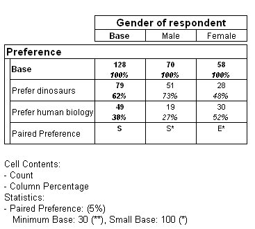
The first paired preference test in this example is carried out on the rows of the table. It tests whether there is a significant difference between the numbers of people who prefer dinosaurs and the numbers preferring human biology.
The script creates a table with Prefer on the side axis and Gender on the top axis:
TableDoc.Tables.AddNew("Table2", "prefer{base(), prefer_dinosaurs, prefer_human_biology, ppt()} * gender", "Paired Preference
Test on Rows")
The difference is seen to be significant for males and not significant for females.
Table showing paired preference test
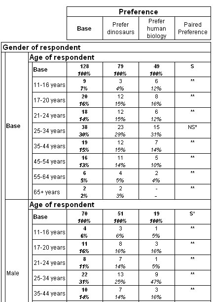
The paired preference test is usually carried out on rows. However, you can also carry out the test on columns. In this example, Age is nested within Gender. As this would create a very wide table if this were on the top of the table, Prefer is placed on the top and the test is carried out on columns.
Table showing paired preference test on columns
Running the paired preference test at two significance levels
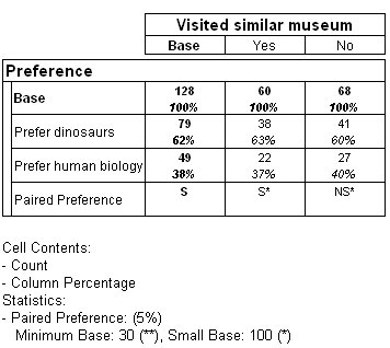
You can carry out the paired preference test at two significance levels in the same table. The next example creates a table with the Prefer variable on the side of the table, and the Similar variable on the top of the table, with a paired preference test applied to the rows of the table. This tests whether there is a significant difference between the numbers who prefer dinosaurs and those who prefer human biology, broken down by whether the respondents have visited similar museums before. This test is run at the 5% significance level, representing a 95% chance that the results are statistically significant and not just due to chance.
Table showing paired preference test at one significance level
This is the script to create the table:
TableDoc.Tables.AddNew("Table4", "prefer{base(),prefer_dinosaurs, prefer_human_biology, ppt()} * {base(), Yes 'Yes', No 'No'}",
"Paired Preference Test at one significance level")
TableDoc.Tables["Table4"].Statistics.Add("PairedPreference")
TableDoc.Tables["Table4"].Statistics.PairedPreference.SigLevel = 5
Notice that for those who answered No, the letters NS are placed in the Paired Preference column, indicating that at the 5% significance level the difference in the numbers who prefer dinosaurs and those who prefer biology is not significant.
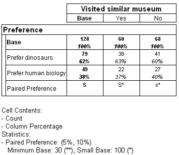
The next example shows the table when the test is run at both the 5% and the 10% level. The 10% significance level indicates a lower level of confidence, representing a 90% chance that the results are statistically significant and not just due to chance.
Table showing paired preference test at two significance levels
This is the script to create the table:
TableDoc.Tables.AddNew("Table5", "prefer{base(),prefer_dinosaurs, prefer_human_biology, ppt()} * similar {base(), Yes 'Yes', No 'No'}
", "Paired Preference Test at two significance levels")
TableDoc.Tables["Table5"].Statistics.Add("PairedPreference")
TableDoc.Tables["Table5"].Statistics.PairedPreference.SigLevel = 5
TableDoc.Tables["Table5"].Statistics.PairedPreference.SigLevelLow = 10
Notice that for those who answered No the lowercase letter s is placed in the Paired Preference column. This indicates that the difference in numbers of those who prefer dinosaurs and those who prefer biology is significant at the lower (10%) level.
See also