Changing the items shown in the table
You can change the items that are shown on a table for a particular variable. For example, consider the table of Age by Gender that you created in
Creating your first table. Suppose you want to change the texts for the table columns to be
Men and
Women instead of
Male and
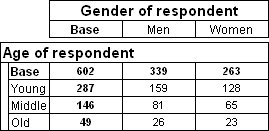
Female, and in the rows of the table you want to exclude the categories for children and young people under 21 and combine the remaining categories into three broad age groups:
Young,
Middle, and
Old. The table would then look like this:
This topic shows you how to make these changes. It assumes that you are working with the Museum sample in which both
age and
gender are categorical variables, and that you have already created a table of Age by Gender as described in
Creating your first table.
First, edit the gender labels.
1 In the Table Definition section on the Define tab, select the gender variable and then choose the Edit Axis icon from the Table Definition toolbar.
The Edit Axis dialog opens. It lists the items that will be shown on the table for the selected variable.
2 Change the text in the Label column for the Male item to “Men” and for the Female item to “Women”.
3 Click OK.
Next, change the categories of the age variable.
4 In the Table Definition section, select the age variable, and then click the Edit Axis icon from the Table Definition toolbar again.
5 Delete the 11-16 years and 17-20 years categories as follows:
Ctrl+click to select the two categories.
From the menu at the top of the list, choose Delete.
6 Collapse the 21-24 years and 25-34 years categories into one category as follows:
Ctrl+click to select the two categories.
From the menu at the top of the list, choose Combine. This combines the two categories into a single category.
Change the label of the new combined category to “Young”.
7 Repeat these steps for the 35-44 years and 45-54 years categories, but give the new combined category a label of “Middle”.
8 Repeat these steps for the 55-64 years and 65+ years categories, but give the new combined category a label of “Old”.
9 Click OK.
10 Populate the table: click the Populate icon

You have now seen that it is easy to change how the variables appear in the table. There are many other changes you can make in the
Edit Axis dialog. For example, you can reorder the categories, and insert nets, subtotals, and special statistical elements to show the mean, standard deviation, standard error, and so on. However, changing the items in this way changes them for the
current table only. If you want to change how the items are shown in
all tables, use the
Edit option on the Variables menu. The changes you make will then be saved in the variable’s
axis expression, which controls the variable'’s default appearance in all tables.
See also

