IBM SPSS Visualization custom chart examples
The following examples can be used to modify the existing chart templates. The examples assume you have read
Exporting charts using IBM SPSS Visualization custom chart types, and are familiar with the information documented on the IBM
SPSS Statistics product site.Sample script
The sample script nVizChartTemplateTest.mrs creates a table with a column proportions statistics to export the HTML chart using the custom chart template. The sample provides an example of exporting charts using IBM SPSS Visualization custom chart types for the HTML export component. The sample script is installed with the UNICOM Intelligence Developer Documentation Library at:
[INSTALL_FOLDER]\IBM\SPSS\DataCollection\7\DDL\ Scripts\General\mrScriptBasic
Modifying a HeatMap chart's color scheme
The following example provides instructions on changing a HeatMap chart's color scheme from red to blue.
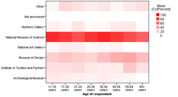
HeatMap chart with red color scheme
You can change the chart's color scheme by modifying the chart elements:
...
<polygon id="polygon_245816" style="polygonStyle">
...
</polygon>
......
<style color="red" color2="black" id="polygonStyle" stroke-width="0.0pt"/>
......
The style attribute is used to modify the chart's color elements. By changing one of the polygonStyle attributes to blue, the chart's color scheme is changed to blue:
...
<polygon id="polygon_245816" style="polygonStyle">
...
</polygon>
......
<style color="blue" color2="black" id="polygonStyle" stroke-width="0.0pt"/>
......
Modifying a HeatMap chart's category order
The following example provides instructions on changing a HeatMap chart's category order.
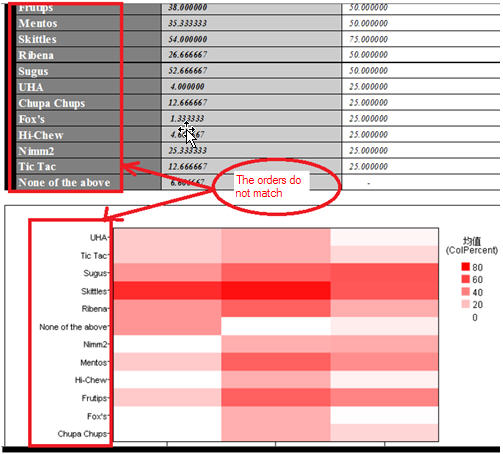
HeatMap chart with a mismatched category order
Given that the category element order does not match the order that is provided to the charting engine, an error related to the Y axis may occur when the chart is created via the IBM SPSS Visualization charting engine.
...
<polygon id="polygon_245816" style="polygonStyle">
<!-- Set the relationship between the template variable and the chart -->
<x variable="X"/>
<y variable="Color"/>
...
Modifying the Color sort method from the default naturalUsingLabel to Data effectively updates the category order.
...
<!-- Data -->
<!-- Set the sort method here for the related axis (X,Y..) -->
<!-- The default sort method is naturalUsingLabel when not explicity set here -->
<categoricalDomain id="categoricalDomain_270236">
<variableReference ref="Color"/>
<simpleSort descending="false" id="simpleSort_270237" method="data"/>
</categoricalDomain>
<categoricalDomain id="categoricalDomain_370236">
<variableReference ref="X"/>
<simpleSort descending="false" id="simpleSort_370237" method="data"/>
</categoricalDomain>
...
See also