Items charted
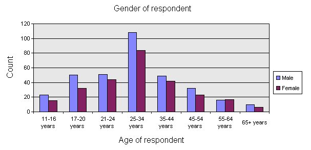
If a table does not contain column percentages, the chart is based on the counts, as shown in this example. For charts that do not contain either column percentages or counts, the charts are based on the first cell item. A chart will not be created for any tables that contain cell prefixes in the column percentage cells. Note that base elements are omitted from the charts.
By default, chart series are based on the table rows. You can base the chart series on table columns by deselecting the Chart table rows as series option in the relevant Export dialog box:
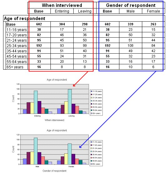
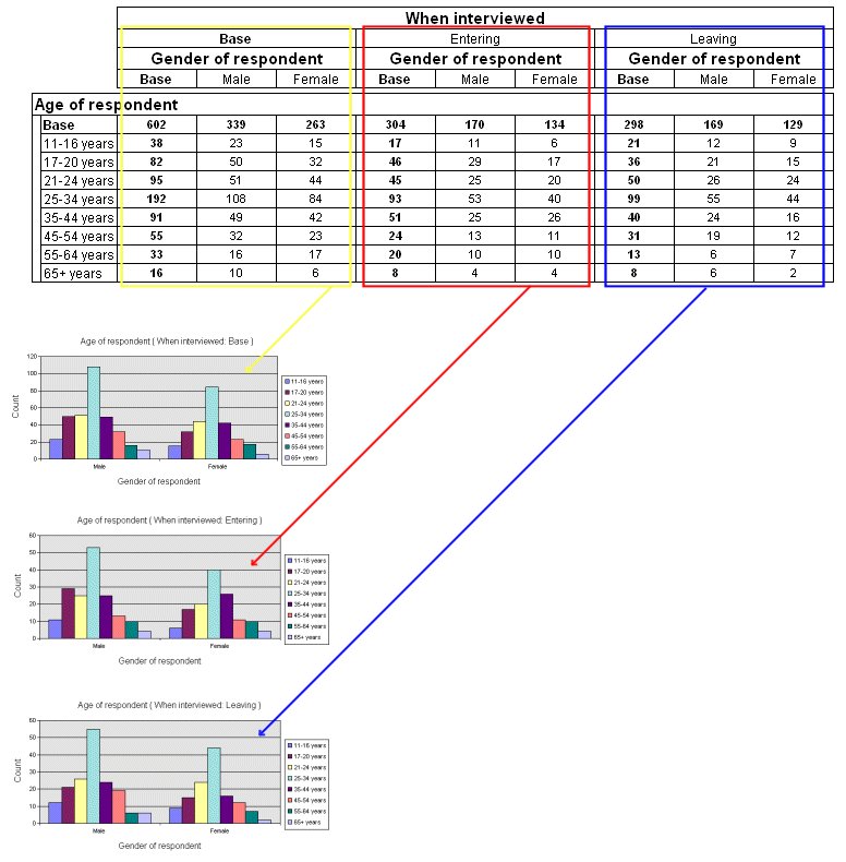
For concatenated and nested tables, a separate chart is created for each section of the table. For example, the following diagrams show the charts that are created for a concatenated and a nested table.
Here is the concatenated table:
Here is the nested table:
Nested table and charts
You can optionally create charts for statistical elements (such as elements that show the mean, minimum value, standard deviation, etc.). If more than one such element is included in the table specification, or if the table includes a mixture of categorical and other elements, a separate chart is created for each statistical element in the table. For example, a separate chart would be produced for each statistical element in the table shown in
Adding summary statistics to a numeric variable. A chart is also produced when a numeric variable is banded. For example, a chart would be produced for the table shown in
Banding a numeric variable.
When you export charts to Excel, PowerPoint, or Word, you can optionally export the charts to a user-defined custom chart type that you have set up using Excel. See
Exporting charts using Microsoft Excel custom chart types for more information.
See also